Wood Pallet Background Image: A Designer’s Secret Weapon (and How to Use It Right)

Image credit: Unsplash / John Doe
If you’ve ever scrolled through a portfolio, a product page, or a social‑media ad that felt instantly warm, rustic, and trustworthy, chances are the designer leaned on a wood pallet background. This unpretentious texture brings a touch of nature and craftsmanship to any visual canvas, and it’s surprisingly versatile. In this post we’ll dig into what a wood pallet background image is, why it works so well, where to find or create one, and best‑practice tips for using it without looking like a “DIY‑store flyer.” Whether you’re a seasoned graphic designer, a small‑business owner, or just a hobbyist looking to level up your Instagram posts, read on.
1. What Exactly Is a “Wood Pallet Background Image”?
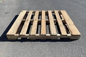
A wood pallet background is simply a high‑resolution photograph (or a digitally‑crafted texture) that captures the surface, grain, and sometimes the subtle imperfections of a wooden shipping pallet. Think of the image you’d get if you placed a camera directly above a stack of pallets in a warehouse, then edited for contrast, color balance, and maybe a touch of vignette.
Why pallets?
- Universal familiarity – Almost everyone has seen a pallet, whether in a grocery store, a moving truck, or a coffee shop. It sparks instant recognition.
- Organic texture – The irregular grain, knots, and weathered edges give a natural, tactile feel that pure flat colors can’t replicate.
- Neutral palette – Browns, tans, and muted grays work well as a neutral base for almost any brand color scheme.
2. Why Use a Wood Pallet Background?
| Benefit | Explanation |
|---|---|
| Instant rustic credibility | Pallets are tied to craftsmanship, sustainability, and “hand‑made” vibes. Great for artisanal food, furniture, and eco‑friendly brands. |
| Versatile mood setting | Light, bright pallets convey a fresh farmhouse feel; darker, weathered pallets give a rugged, industrial edge. |
| Low‑cost visual impact | A single high‑quality texture can replace expensive set‑design or photography, especially for digital assets. |
| Seamless patterning | When tiled correctly, pallets create an endless background that works for web headers, social posts, and even print. |
| SEO‑friendly | Adding a descriptive alt‑text (“wooden pallet texture background”) can enhance image‑search visibility and accessibility. |
3. Where to Find Free & Premium Wood Pallet Images
| Source | Free / Paid | Quality | License Highlights |
|---|---|---|---|
| Unsplash | Free | 4K‑ish, artistic | No attribution required, commercial use allowed |
| Pexels | Free | 2–3 K | Same as Unsplash |
| Pixabay | Free | Varies | Check “no attribution” filter |
| Shutterstock | Paid | Up to 8 K, curated | Standard & extended licenses available |
| Adobe Stock | Paid | 5–12 K | Includes model releases if people appear |
| Envato Elements | Subscription | 5 K+ | Unlimited downloads, commercial usage |
| DIY – Shoot your own | Free (besides gear) | Unlimited control | Full ownership, no licensing worries |
Pro tip: When downloading free images, always double‑check the “commercial use” toggle. Some photographers request attribution; it’s courteous (and often mandatory) to credit them in the image caption or a footer.
4. How to Create a Custom Wood Pallet Background (Step‑by‑Step)
If you want something truly you—maybe a specific type of wood, a certain level of wear, or a color tint—follow this quick workflow:
- Gather Materials
- A clean wooden pallet (or two different pallets for variety)
- A large, flat surface (e.g., a studio table)
- Natural lighting (window light works great)
- Shoot the Photo
- Use a DSLR or a high‑quality smartphone (12 MP+).
- Position the camera directly above the pallet (try a 90° angle).
- Shoot multiple exposures: one with bright daylight, one with a softbox for even lighting.
- Edit in Photoshop / Affinity Photo
- Crop to a perfect square (e.g., 3000 × 3000 px).
- Adjust Levels to boost contrast and bring out grain.
- Remove unwanted objects (nails, stickers) using the Healing Brush.
- Create a seamless tile (Filter > Other > Offset; set X/Y to half the width). Fill the seams with the Clone Stamp.
- Color‑grade (Optional)
- Apply a subtle photo filter (e.g., “Warm Sepia”) to match your brand palette.
- Use Selective Color to mute reds or boost yellows for a sun‑kissed look.
- Export
- Web: JPEG (quality 80‑90) or WebP.
- Print: TIFF, 300 dpi, CMYK.
- Save the Master PSD so you can quickly generate variations (different overlays, opacity levels, etc.) in the future.
5. Best Practices for Using a Wood Pallet Background
5.1 Keep the Focus on Your Content
- Opacity matters. If you overlay text or a product photo, set the pallet’s opacity to 70‑85 % or add a subtle dark overlay (
rgba(0,0,0,0.2)) to improve readability. - Avoid busy angles. A perfectly flat, top‑down view works best. Side‑view shots can distract from the main message.
5.2 Pair with Complementary Typography
| Font Type | Why It Works |
|---|---|
| Serif (e.g., Playfair Display) | Echoes the classic, handcrafted vibe. |
| Hand‑written script (e.g., Amatic SC) | Adds a personal, artisanal touch. |
| Sans‑serif clean (e.g., Montserrat) | Balances rustic texture with modern clarity. |
5.3 Use Consistent Color Schemes
- Pull accent colors from the pallet (deep brown, faded tan). Use tools like Adobe Color or Coolors to generate a palette.
- Keep the brand’s primary color for CTAs, ensuring contrast meets WCAG AA/AAA standards.
5.4 Optimize for Speed
- Compress images with TinyPNG, ImageOptim, or the built‑in “Save for Web” dialog. Aim for < 150 KB for hero sections.
- Lazy‑load the background if it’s not immediately visible.
5.5 Accessibility & SEO
- Alt‑text example: “High‑resolution wood pallet texture, warm brown tones, perfect for rustic website backgrounds.”
- ARIA role: If the image is purely decorative, add
role="presentation"oraria-hidden="true"to avoid screen‑reader clutter. - File naming: Use descriptive filenames (
wood‑pallet‑background‑brown‑2025.jpg) to aid image‑search crawlers.
6. Real‑World Examples (What Works & What Doesn’t)
| Site/Brand | How They Used the Pallet | What Works | What Could Be Better |
|---|---|---|---|
| Farmhouse Café (Instagram) | Full‑screen story background behind menu items | Subtle opacity + white text → high legibility | None – the balance is spot‑on |
| Eco‑Build Supplies (Landing Page) | Header banner with product shot on top | Strong contrast with a dark overlay, brand orange CTA | The pallet repeats too obviously; a larger seamless texture would smooth it |
| Hand‑Made Soap Co. (Packaging) | Printed label on a matte pallet background | Grain adds tactile feel even on paper | Color saturation too high; softening the hue would better showcase product colors |
| DIY Blog (Sidebar) | Small thumbnail behind author photo | Adds personality without overwhelming the layout | Text overlay too thin; increasing font weight would improve readability |
Takeaway: The sweet spot is “visible yet unobtrusive.” The pallet should support the message, not compete with it.
7. Quick “Copy‑Paste” Style Guide (for Teams)
/* CSS snippet for a wood pallet background hero */
.hero {
  background-image: url('/assets/img/wood-pallet-bg.jpg');
  background-size: cover;        /* ensures full coverage */
  background-position: center;   /* centers the grain */
  background-attachment: fixed;  /* optional parallax effect */
  position: relative;
  color: #fff;                   /* white text for contrast */
}

/* Optional dark overlay for readability */
.hero::before {
  content: "";
  position: absolute;
  inset: 0;
  background: rgba(0,0,0,0.35);
  pointer-events: none;
}
Add this to your stylesheet, replace the file path with your own image, and you’re ready to roll.
8. Frequently Asked Questions
| Question | Answer |
|---|---|
| Can I use a pallet background for a corporate finance site? | Yes, but tone‑down the rustic feel. Choose a lighter, smoother pallet and pair it with a clean, sans‑serif typeface to keep the vibe professional. |
| Do I need to worry about copyright if I edit a free image? | The underlying license still applies after editing. If the original is “Free for commercial use, no attribution required,” you’re good. Always keep a copy of the license page for reference. |
| What resolution is safe for a full‑width web banner? | Aim for at least 2560 × 1440 px (16:9) for retina displays. Compress to ≤ 200 KB for fast loading. |
| Should I add a subtle pattern (like a diagonal line) on top of the pallet? | Yes, a very low‑opacity pattern can add depth. Keep it under 5 % opacity so it doesn’t distract from the main content. |
| Is it OK to combine a pallet background with another texture (e.g., concrete)? | Absolutely—layering can create a “mixed‑material” aesthetic. Use blending modes (multiply, overlay) and adjust opacity to maintain harmony. |
9. Wrap‑Up: The Bottom Line
A wood pallet background isn’t just a pretty picture—it’s a design shortcut that instantly conveys authenticity, sustainability, and warmth. When sourced responsibly, edited thoughtfully, and applied with a clear hierarchy, it can elevate anything from a modest Instagram post to a high‑traffic e‑commerce homepage.
Ready to give your brand that handcrafted edge? Grab a free pallet image from Unsplash, give it a quick tweak in Photoshop, and watch how the texture breathes life into your next project.
📣 Call to Action
- Download a free pallet texture right now: Unsplash – Wood Pallet Collection
- Try the CSS snippet above on a test page and see the instant impact.
- Share your work! Tag us on Instagram @DesignRoots with #PalletBackground for a chance to be featured in our next blog post.